 Raphael Thys
drew this one for this article :)
As a designer I find myself typing “best UI practices” into Google Search when designing any part of the project to see what can be improved when designing UI elements.
This is my first article and I decided to share some things I learned about one of the most used UI elements — Text Fields
I tried to make these examples and explanations as concise and clear as possible.
Clickability
- Separate background from a text field for strong clickability and space cues

Corners
- Experts say that rectangles with rounded corners are easier on the eyes than a rectangle with sharp edges.
- Rounded corners on text fields could cause users to view your form as more user-friendly.

Labels
- Avoid using CAPS for labels. All-capitalized letters are hard to scan and read.
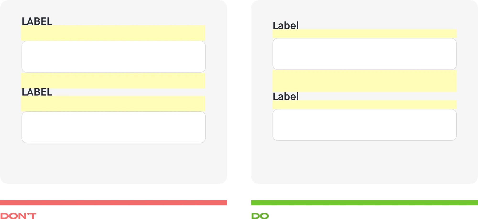
- Put each label close to the input field to make them visually grouped.
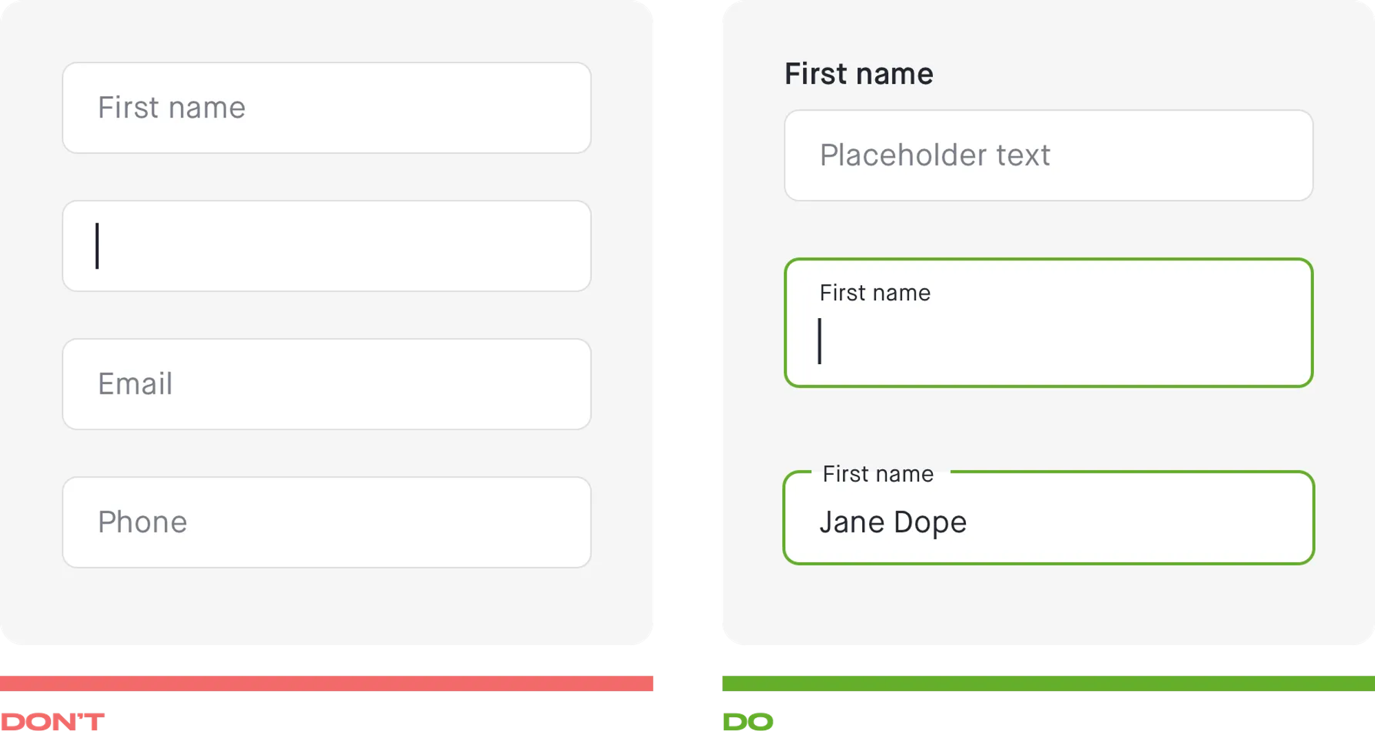
Labels & Placeholders
- Never use placeholder text instead of a label. Use static or floating labels.
- Placeholder would disappear once the user interacts with the input field. It can lead users to forget the purpose of the field.
- Without labels, users cannot check their work before submitting a form.
- Floating labels can save space on mobile devices.
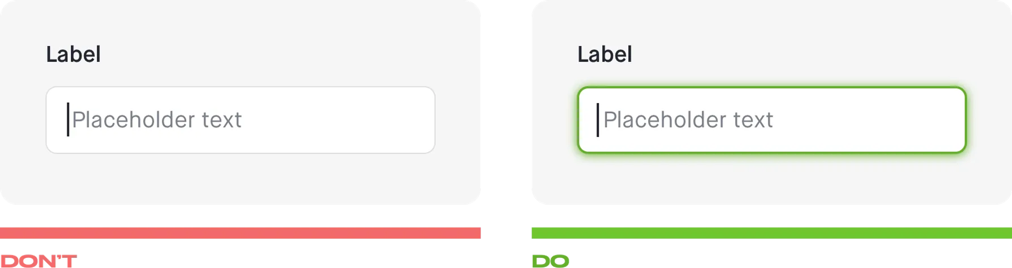
Select state
- Auto-focus the first input field.
- Highlight the active field to make it easy to focus on it.
- Changing the border color and increasing the border thickness from 1 pixel to 2 is enough.
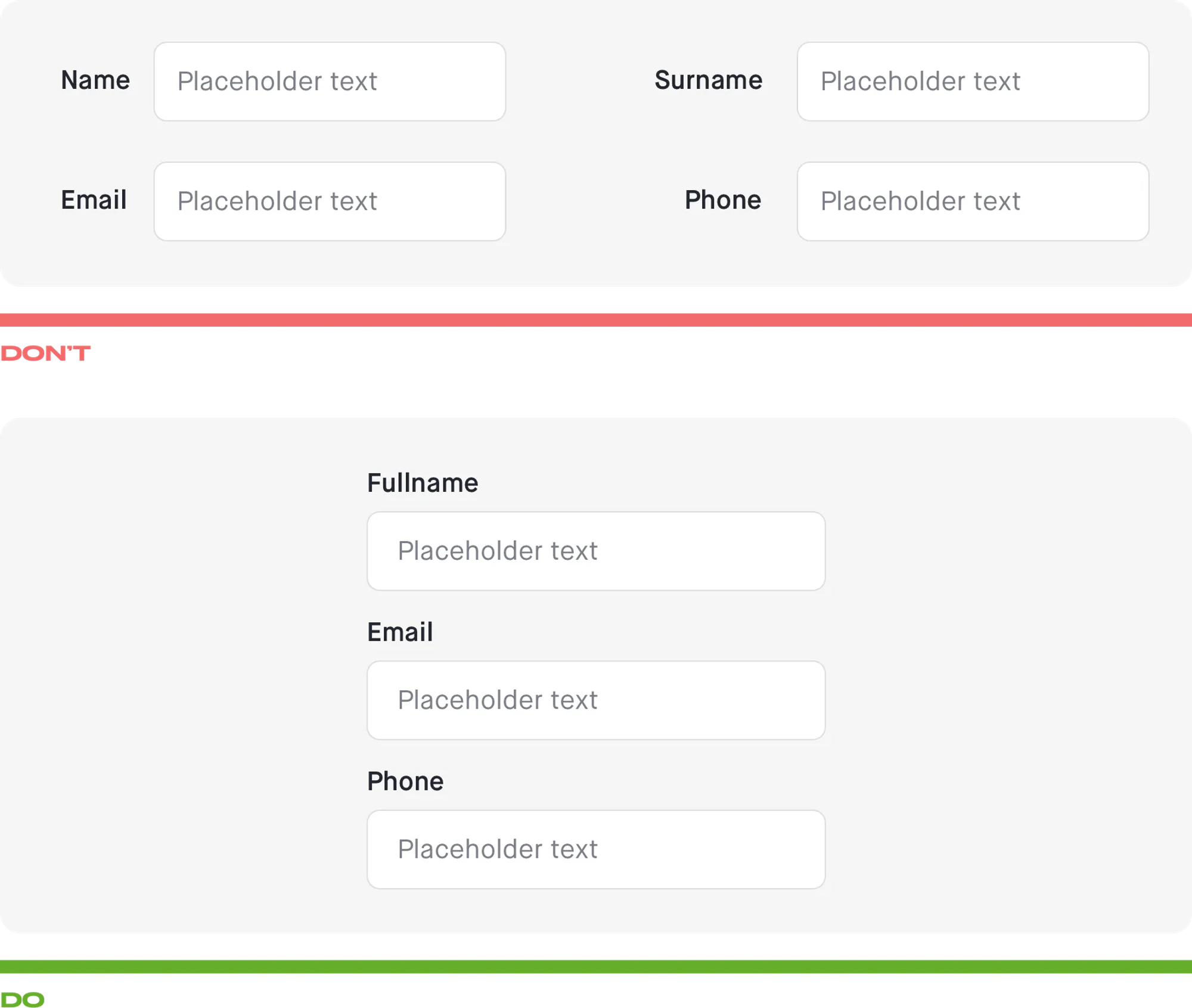
Single Column Layout
- Put field labels above the fields to improve the way users scan the form.
- More space available for labels.
- Dramatically increases the completion time
- The eyes move naturally from the top to the bottom.
- Removes confusion in the user’s mind regarding the order and dependency of the fields to each other.
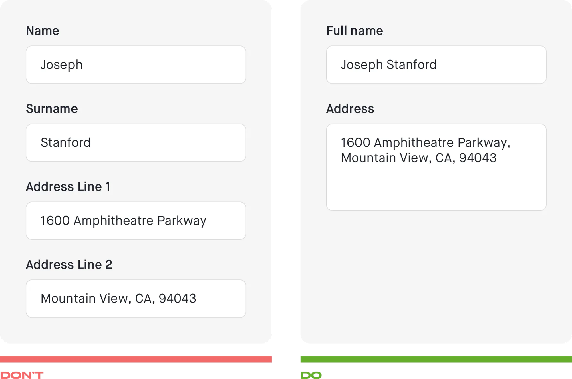
Combine Data Fields
- If you don’t have specific reasons do not separate fields that can be combined.
- Follow the real-world format.
- Support international formats.
- Use separate fields for city, state, and zip code since they need to be processed separately.
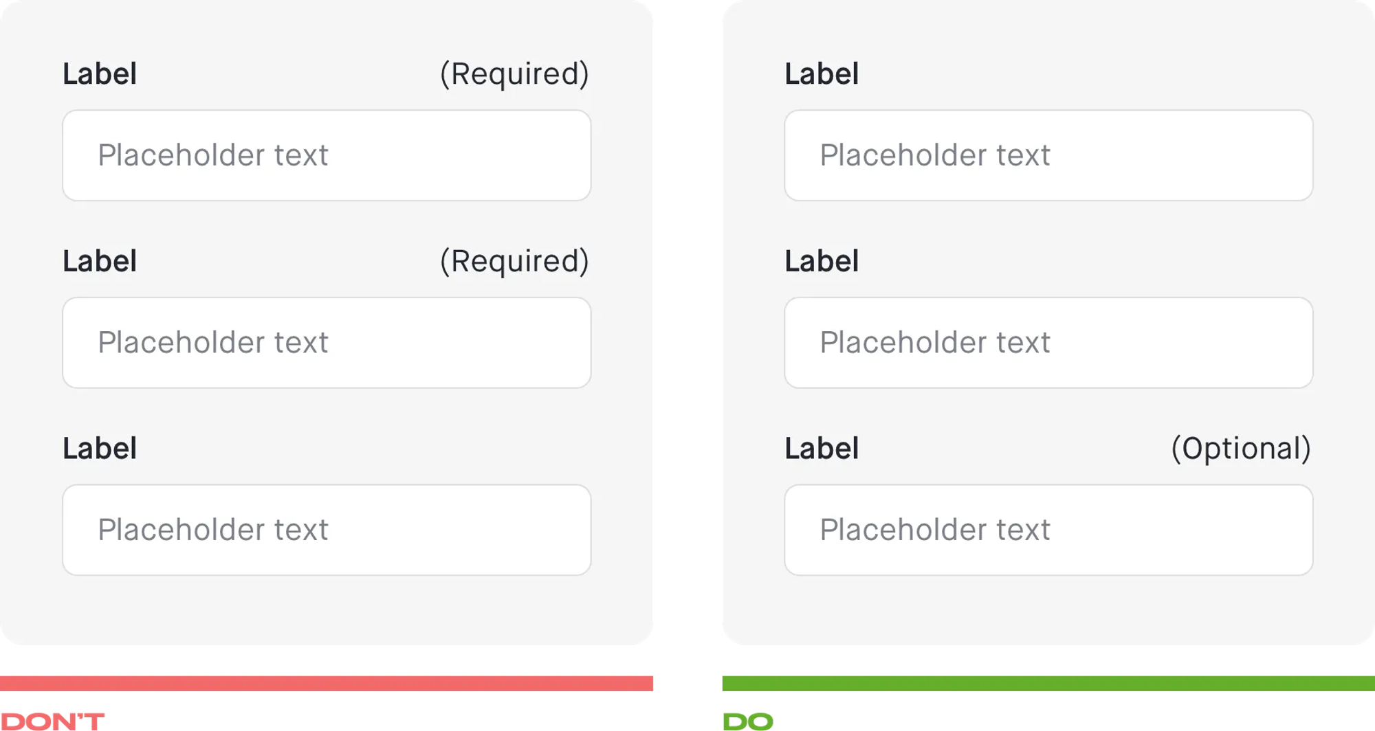
Optional vs Required
- Try to minimize the total number of fields.
- Make sure that the fields that are not Required are marked as being optional.
- Avoid using an asterisk (*) since users might not understand it’s meaning.
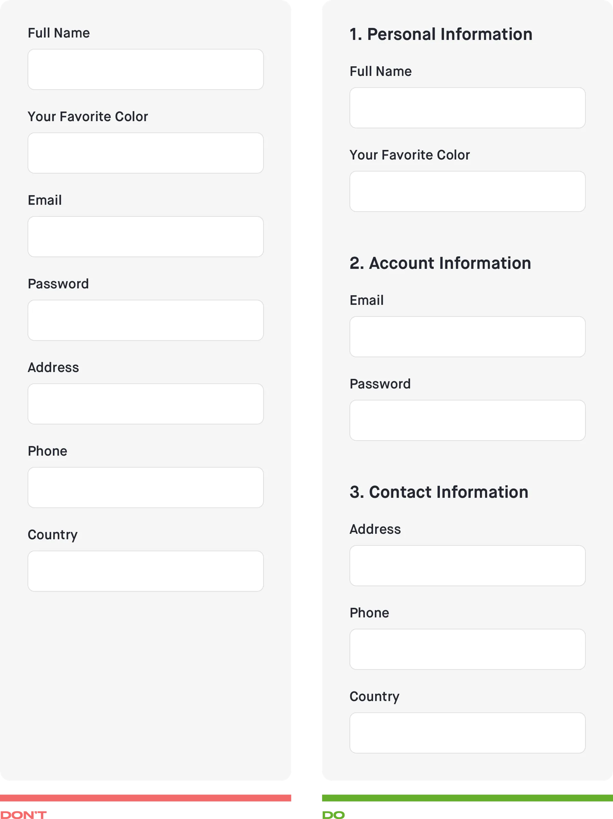
Group related fields
- Group related fields into logical sections.
- Use white space between sections to distinguish them visually.
Visual & Input Constraints
- Use different field length sizes based on the required information.
- The size of a field provides a visual constraint to the user.
- To decrease the number of mistakes and wrong data use the constraints on what can be inputted into the field:
— min and max length (num. of characters)
— format;
— numeric, alphabetic, alphanumeric, all symbols;
Password
- Do not use a “Retype password” field.
- Instead, provide an option that allows users to check the password.
- Show if the Caps Lock is on to reduce errors.

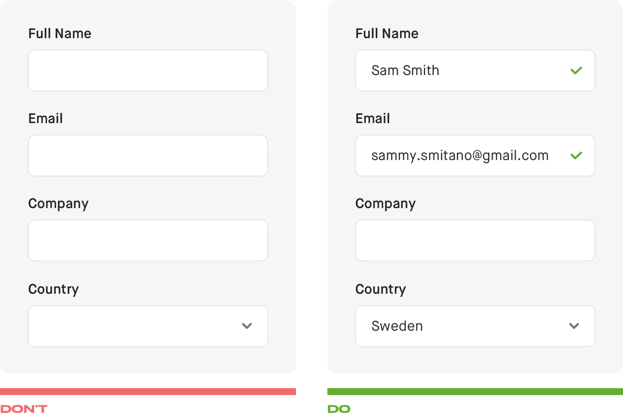
Pre-fill and Auto-detect
- Pre-fill any information about a user from data previously provided by them or computed data based on their IP address, zip code, etc.
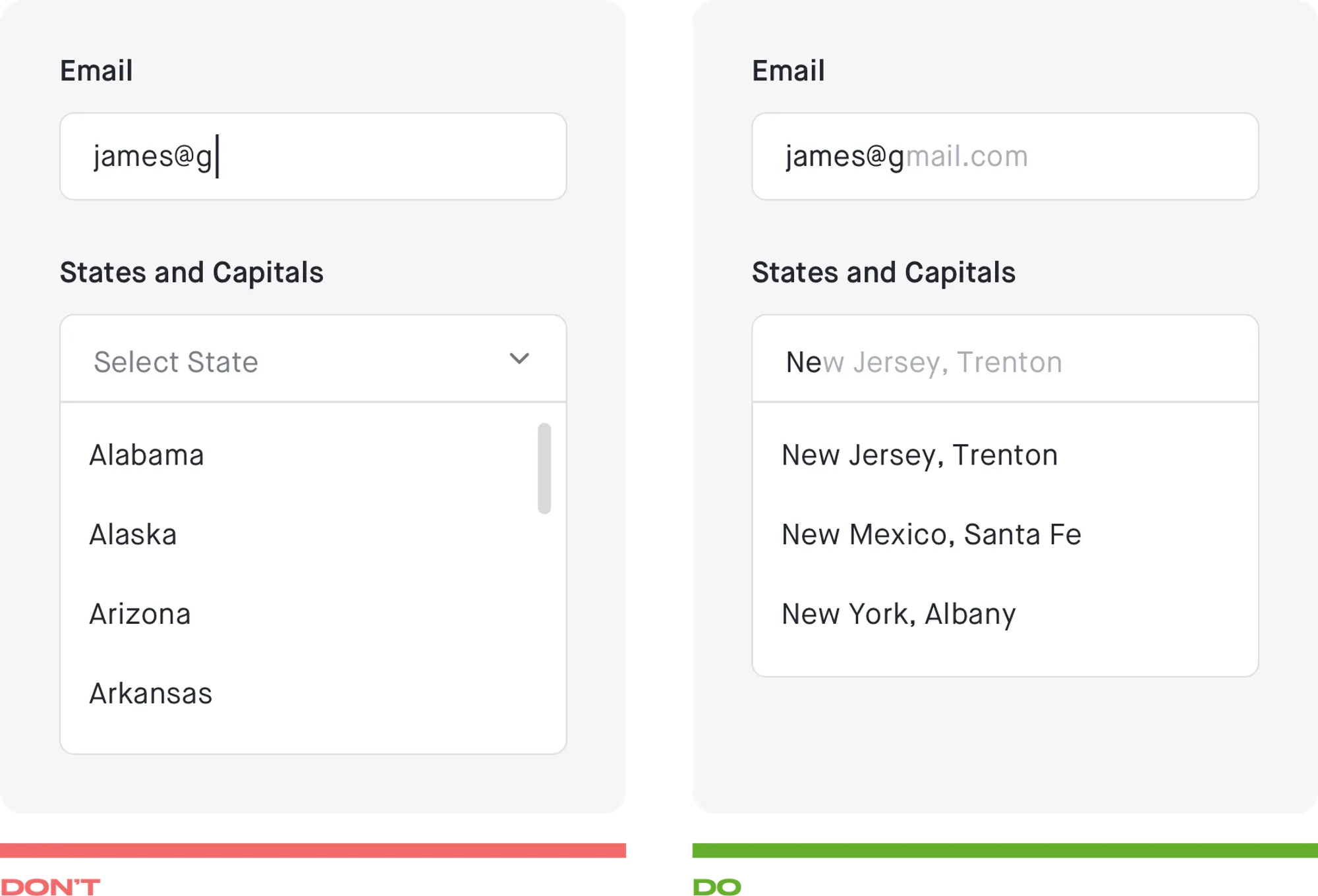
Autocomplete
- Autocomplete when possible to save users from typing.
- Provide users with a list of suggestions related to what the user has typed.
- Use autocorrection to modify words that appear to be misspelled.
- Don’t use Select Menus for Known User Input.
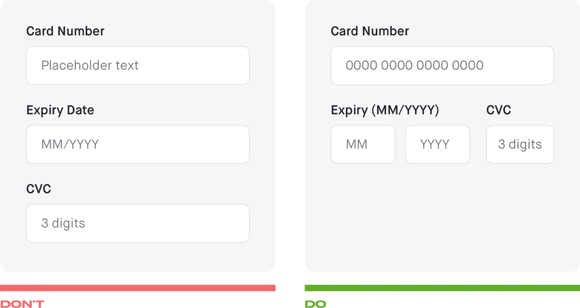
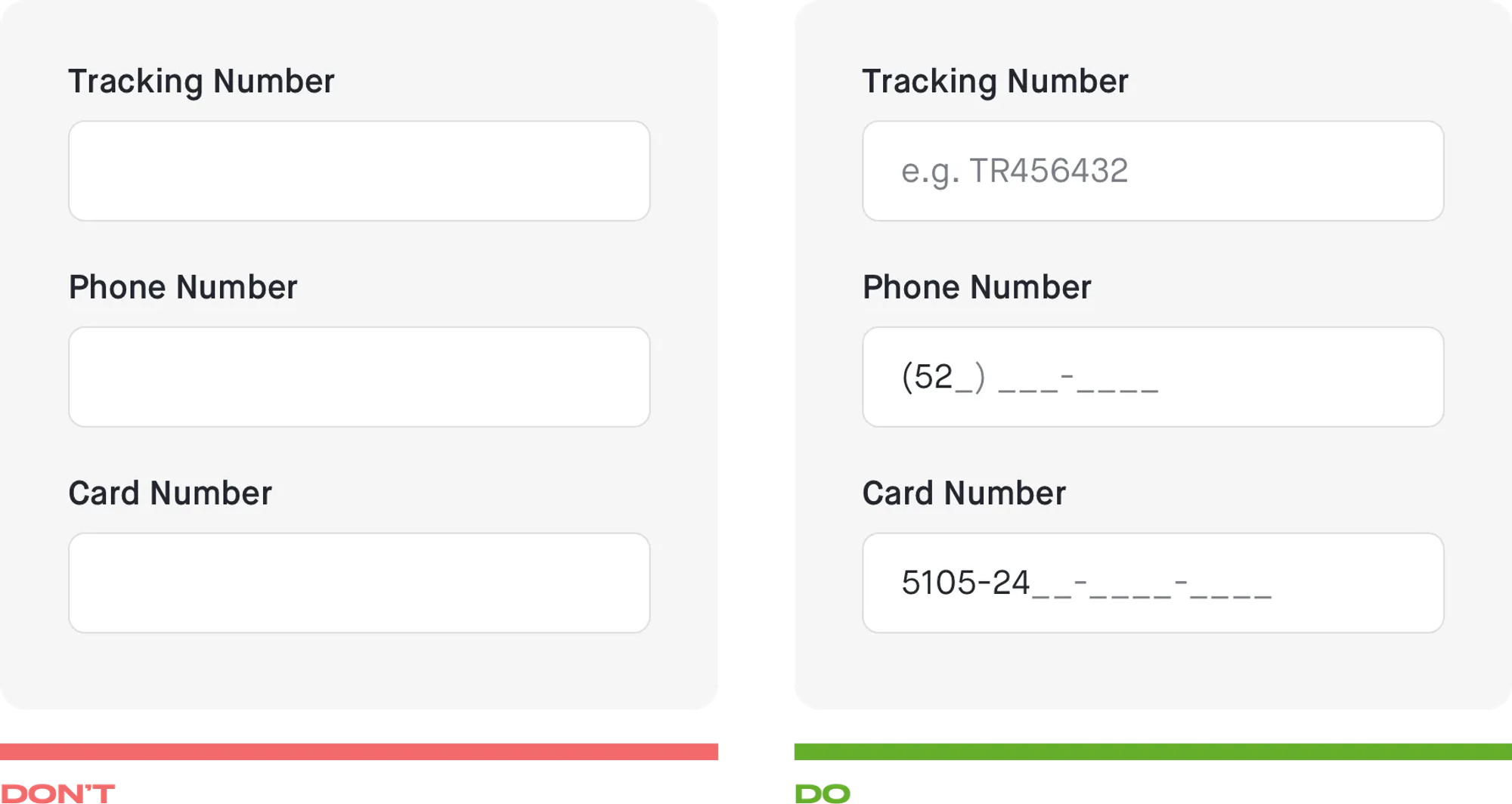
Placeholders & Masked Input
- Use placeholder text to give a hint about what content is expected for fields that require data in a specific format.
- It’s better to use masks instead of placeholders for Phone Numbers, Card numbers, expiry dates, etc.
- You must always consider local differentiation. The field labels, placeholders, masks, etc. can be different for different countries or regions.
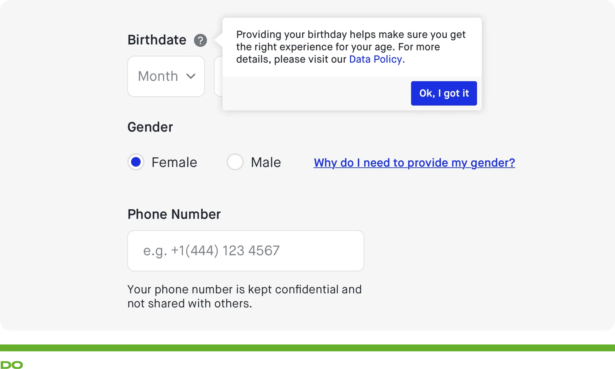
Explain why
- To prevent unnecessary doubts and questions you must explain why you ask some specific data like the phone number, birthday, weight, spouse name, etc.
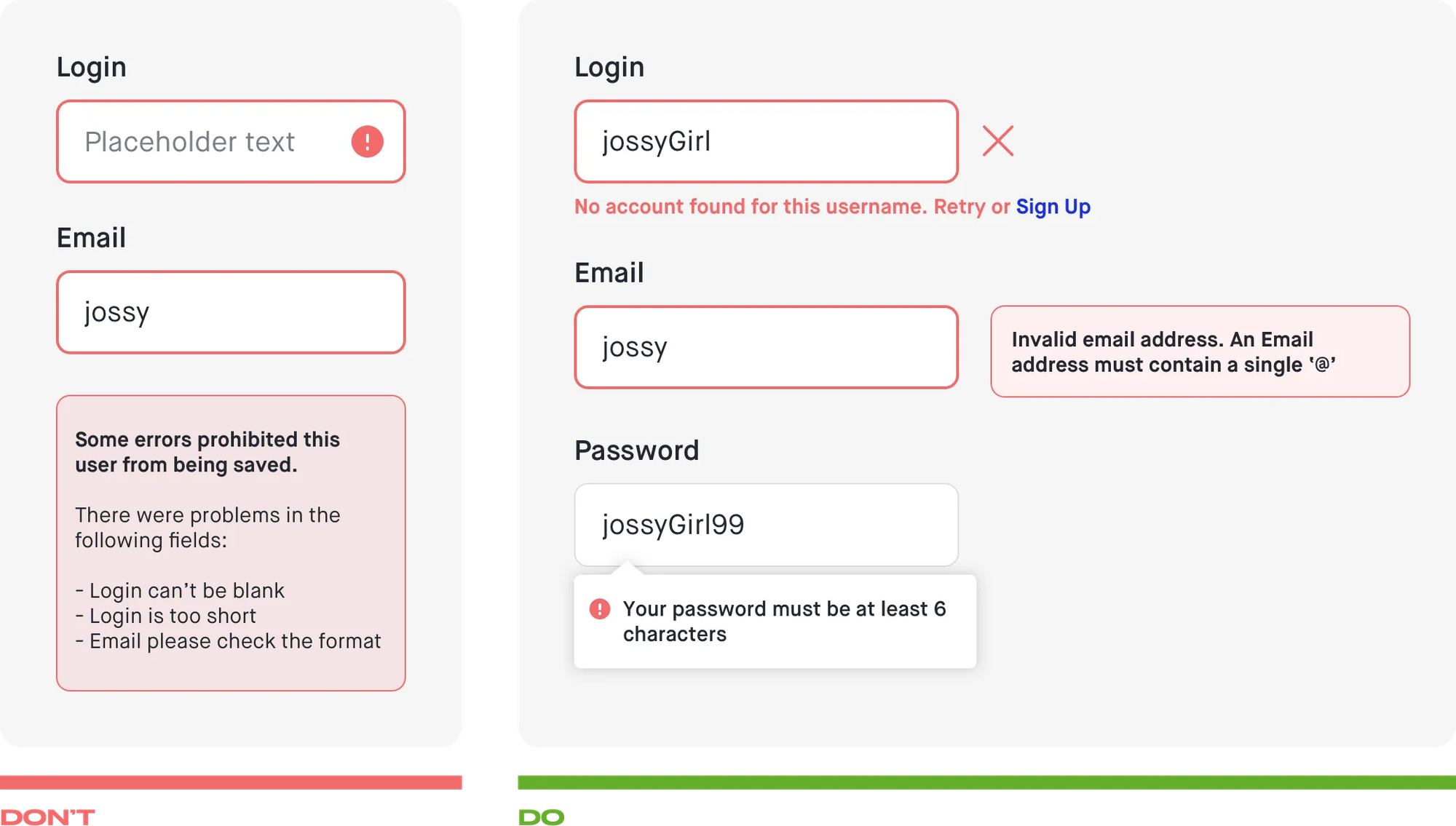
Error messages & Validation
- Don’t hide your error messages
- Show which field caused the error preferably using a red color signal to attract attention.
- The usage of icons and supportive will help colorblind people fix the problems.
- Place error messages to the right of the field for the web and the bottom for mobile.
- Provide information about what can a user do to fix the situation.
- Be clear, precise and polite in your messages.
- Don’t place a large summary of errors at the top or bottom of the page.
- Provide information just in time (Telling users at the right time)
- Decide should the user get live feedback? When leaving the focus of the input? When submitting the form?
- Use inline validation with real-time feedback immediately for strict requirements like username, password.
- Inform in plain and simple language that a non-technical user understands.
Grateful for these articles that helped me in my research:
https://uxplanet.org/the-18-must-do-principles-in-the-form-design-fe89d0127c92
https://www.smashingmagazine.com/2018/08/best-practices-for-mobile-form-design/
https://uxdesign.cc/11-form-design-guidelines-4b2f1c659414
https://uxdesign.cc/the-ux-behind-designing-better-forms-d6ebe7a817d2
Your feedback is really appreciated. Thanks and keep designing :)